Amazon Kindle New Social Feature

The Opportunity
The Kindle app doesn’t connect readers to other readers or to other books. The opportunity, people love to discuss what they are reading. With this 3rd project for my UXDI class, my group of two others and myself were given the task of designing a social feature for the Kindle IOS IPad app in a span of about 10 days. My role for this project was to co-lead as a UX designer and researcher.
Research
User Interviews
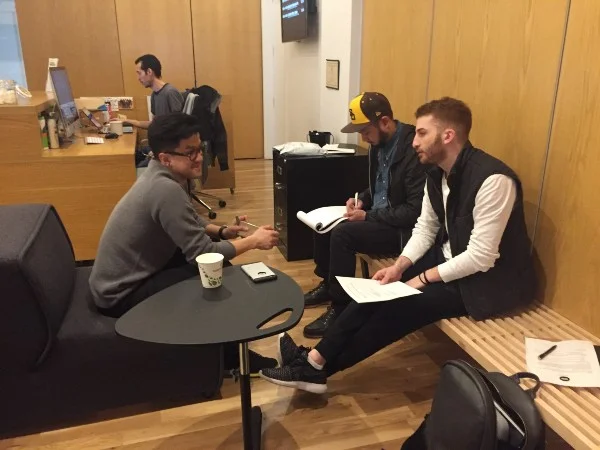
Conducting User Interviews
Beginning the research phase, we conducted 6 user interviews. These interviewees were both e-book readers or physical book readers. They also varied from frequent readers to less frequent readers. Our goal of these interviews were to discover the behavior of reader. We wanted to learn how often people read, what platforms they use to read, if they discussed what they were reading with friends or others, and if they shared books with friends. Lastly, we wanted to see how active these users were on social media, to see how their socializing had a correlations to their reading habits.
Findings
After conducting user interviews, we wanted to synthesis our data. In order to synthesis our data we began affinity mapping. So, we did this by writing main points from our interviewees on post-it notes and placing them on a white board. This allowed us to find commonalities and trends in our data.
Affinity Mapping
Through our user interviews we were able to validate our initial assumption. People do love to discuss what they are reading. We found that 4/6 users discussed what they reading while and after reading their books. People wanted to have a sense of control over their book discussions. Also, people needed to express both their positive and negative emotions while reading a book.
“I would love to talk about a book especially if it’s a book that I can’t put down." “Book recommendations from friends are more important than seeing the top bestselling books.”
We also found that 6/6 users only read recommended books from friends because they were more trusted over strangers recommendations. People respect and value their friends opinions.
Personas
We created three personas from all of our findings. Our first and primary persona was Emma a 24 yr old female masters student, who worked part time. She loves to go out with her friends and constantly stay connected with them on social media. She loves to read both for school and pleasure and discuss what she is reading with friends or co-workers. For these reasons she was our target user for our social feature on the Kindle app.

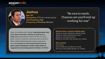
Our second persona was Joshua, he was a workaholic who has a medial frequency of rating. But he still tired to connect to friends and read books as much as possible.
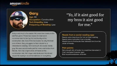
Our third persona was Gary. Gary was opposite to a target user. He had a very low frequency of reading, but when he did it was only through a recommendation from a friend. We created this persona because it would enable us to create new feature to bring in more untypical users to Kindle. These personas were created to help us come up with features to implant during our design process.
Problem Statement
From these personas we were able to identify main pain points in our users. We correlated these pain points and formulated a problem statement.
- Problem Statement: As an E-reader user, it is hard to trust book recommendations and find book discussions that are worthy of my time.
Competitive Analysis
The next step in our process was to conduct analysis on 6 competitors to Kindle. We wanted to find common features in all 6 competitors and see how and if these features solved problems faced by our users. The 6 competitors were GoodReads, Glose, Kobo, Reddit, Wattpad and iBooks. Here are some common features that were found:
- Search for books
- Read a book
- Some sort of social media aspect
- Shared discussions
- Rate books
- Recommendations based on algorithms.
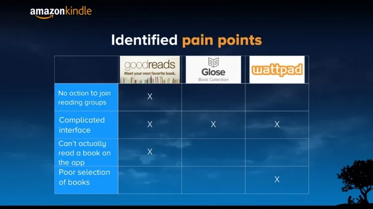
After comparing these features, we narrowed down our analysis of competitors to just three GoodReads, Glose, and Wattpad. We narrowed down to these three because they all had some sort of social feature. Here are some of their social features:
- Follow readers
- Discussion boards
- Write reviews to the authors
We then found trending pain points in all three competitors. Users could not see where other readers were in a book. Other pain points were that they all had complicated interfaces and no live chat options for their readers.
Feature Prioritization
Feature Prioritization Chart
Through our competitor analysis we were able to come up with features that would contribute to our design of a social feature. This allowed us to create features that were both new and existing from competitors that would best fit our user needs. We then used a feature prioritization chart to help us prioritize which features were most essential to implement into our app. From this we were able to narrow down to 7 features that were essential and for the most part low effort. Here are the 7 features we decided to use for our Kindle social app:
- Live Chat with Friends
- Profiles
- Follow/Add Friends
- Bookshelf
- See What Your Friends are Reading
- See Where Your Friends are on a Book
- Send Recommendations
Design
Design Studio
From all of our research we began to start focusing on a direction in design process. We began this process by collectively drawing out very low fidelity wireframes in design studio. This gave us the ability to bring all our designs together into one design.
Our group working together in a design studio session
After we all agreed on a starting point for our design, we drew up low fidelity wireframes on a white board. This allowed us to visualize how our features would work and visualize the slow of our wireframes.
Low fidelity sketches
Wireframes and Wire Flows
From these sketches, we then created higher fidelity wireframes in Sketch. We kept these wireframes consistent with the Kindle brand, to ensure less confusion for users.

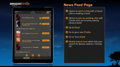
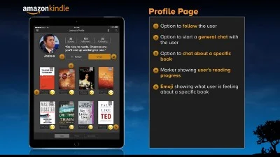

The Kindle wireflow on the right shows how users interactions on one page would lead them to the next page. By keeping the users needs in mind we wanted to design the flow of our app in the most desirable way possible.
Kindle Social App wireflow
User Testing
After creating the wireframes in Sketch, we transferred our wireframes into InVision. This allowed us to make a tapable prototype to use for testing.
We tested our prototype on three e-reader users. Each user was given scenarios and tasks to go through the app.
Scenario 1: You recently ran into your friend, Joshua L. from undergrad. You got to talking about books and then learned that you both have a Kindle Social account. You want to add Joshua to your list of friends. How will you do that from this screen?
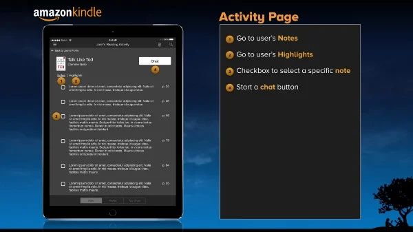
Scenario 2: Now that you’ve added Joshua, you looked at his profile and saw that you’re reading the same book (Talk Like Ted). After looking at his activity, you saw that he annotated the book and you want to ask him what he meant. How will you do that?
Through these user testing we were able to identify pain points of the users going through each scenario. From these findings we were able to iterate our designs to solve these problems.
Findings and Iteration
Iteration 1
Finding 1: Our first finding was that 3/3 users could not find the social button on the main menu. We had to improve this, so we added a social icon on the top navigation bar. (Iteration 1)
Iteration 2
Findings 2: Our second finding was that 2/3 users tapped on the actual book instead of the “Chat about this book” button. So we removed this button and made the actual book responsive to the tape, which led to the chat page. (Iteration 2)
Iteration 3
Finding 3: We found that 2/3 users did not know what the emoji under the book meant. To solve this issue were removed the emoji and replaced it with user’s rating, depicted by stars. (Iteration 3)
Iteration 4
Finding 4: For our fourth finding, we found that users were not able to figure out what the reader’s progress of a book was. So we removed the bookmark percentage indicator and created a progress bar that showed what page the reader was on. (Iteration 4)
Iteration 5
Finding 5: Lastly we found that 2/3 users tapped the whole note instead of the checkbox. So what we did was make the whole note tappable including the checkbox. (Iteration5 5)
Prototype
For prototype or more information please contact me.
Next Steps
We added a few features to our wirefames that we felt would help user better understand our app. These would be a great addition in the future. The first step, would be to add the number of notes and highlights under each book. This was done so the users could have a way of knowing which book was highlighted or annotated, so they can be discussed.
The second next step, would be to show the page number from where each note that is sent into the chat was taken from. This is done so the users in the chat would be able to easily identify between each notes.
Lastly, in the near future we would love to add features that we didn’t include from our feature prioritization chart (please see chart above). These features were best seller lists and a list of recommended books by user’s friends on the social app. Given more time we would love to design and launch this app for Iphone.
What I Learned
Creating a new feature for the Kindle app that hasn't been done in the past is always a challenge. Especially when this feature would connect users in a whole new platform. But, that being said, with the right team anything can be accomplished. The key to this project was strong research. As a team, moving in an efficient pace, we conducted extensive research and synthesized our data over and over again. This allowed us to figure out solutions and validate our assumptions to successfully produce a deliver a new feature.